

One of the most common (and costly) sign mistakes is ordering letters that look great on a design file and end up unreadable on the wall. A lobby sign sized for a 10-foot hallway is invisible from across a large reception area. A storefront sign sized for window decals will not be read from a moving car. Getting the lettering size right is not a matter of opinion: there is a straightforward relationship between letter height and how far away a person can comfortably read it.
This guide covers that relationship, gives you a practical reference chart, and walks through the variables that shift the numbers depending on whether your sign is going indoors, outdoors, or on a building facade.
The 10-Foot Rule Explained
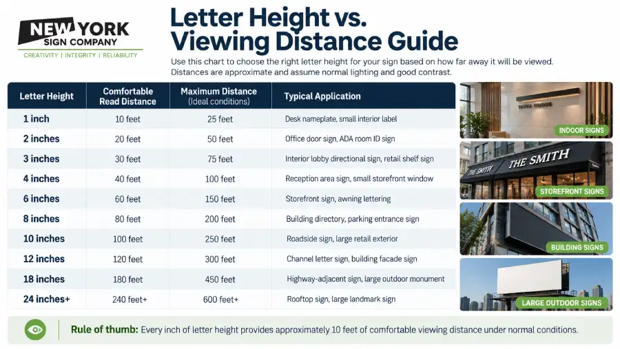
The industry standard starting point is simple: for every inch of capital letter height, a sign can be read comfortably from approximately 10 feet away. This applies to standard high-contrast signage (dark text on a light background, or light text on a dark background) in normal lighting conditions.
So a sign with 2-inch letters is readable from roughly 20 feet. A sign with 6-inch letters from about 60 feet. A channel letter sign on a building facade with 12-inch letters from around 120 feet.
That ratio assumes optimal conditions. Lighting, contrast, typeface, viewing angle, and background clutter all affect actual readability, and we will get to each of those below. But the 10-foot rule is the right place to start because it gives you a number to work backward from.
Letter Height vs. Viewing Distance Chart
Use this table as your baseline when planning any sign. The ‘comfortable read’ column is the recommended distance for a sign that will be seen by someone standing still or walking slowly. The ‘maximum’ column is the outer limit under ideal conditions.
Indoor Signs: Lobbies, Offices, and Retail
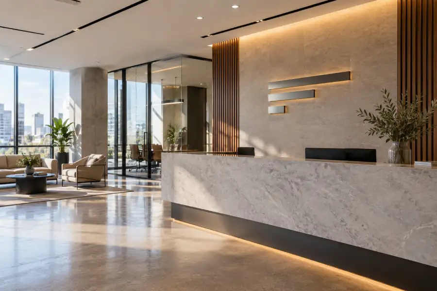
Interior signs follow the same letter-height formula, but the relevant viewing distances are usually shorter and more predictable. A receptionist lobby is typically 15 to 30 feet deep. A corridor is rarely more than 50 feet long before a turn. That means most interior signs work well with letter heights between 2 and 6 inches.
The exception is large open-plan spaces. A manufacturing floor, a hospital atrium, or a grand hotel lobby can have sight lines of 80 to 100 feet. In those spaces, undersizing is a real risk: a 4-inch letter that would work fine in a standard office hallway becomes difficult to read from across a large reception area.
Interior sign materials also affect readability. High-gloss acrylic can create reflective glare under overhead lighting that reduces effective contrast. For large open spaces, dimensional letters or backlit elements help compensate. If you are planning an interior sign package for a commercial office or medical practice, our team at New York Sign Company can help you size and spec every sign correctly before production. Learn more about our custom signs options, from lobby logos to ADA-compliant door signs.
Outdoor Signs: Storefronts, Awnings, and Building Facades
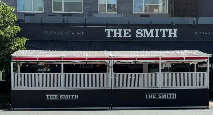
Outdoor signs have to work under a much wider range of conditions: direct sunlight, rain, nighttime visibility, moving pedestrians, and passing vehicles. The chart’s comfortable-read distances assume a person standing still in normal daylight. For signs that need to catch attention from a moving car, multiply the required letter height by 1.5 to 2.
A storefront sign above a door needs to be readable from the sidewalk across the street, typically 20 to 40 feet depending on the block width. In a dense urban setting like Manhattan or downtown Brooklyn, that means letters of at least 4 to 6 inches. If the sign also needs to be read from a moving vehicle on the roadway, 8 to 10 inches is more appropriate.
Elevated signs on building facades, like rooftop signs or signs above the second floor, need larger letters because the vertical angle adds distance beyond the horizontal measurement. A sign mounted 30 feet above street level and 40 feet from a pedestrian is effectively 50 feet away when you account for the angle. Our building signs page covers exterior building and facade options, with real project examples from our work across the New York metro area.
Factors That Change the Calculation
Several variables shift the comfortable-read distance up or down from the baseline chart:
- Contrast: High contrast (black on white, white on dark) is the easiest to read at distance. Low-contrast combinations (gray on gray, yellow on white) can cut effective readability by 30 to 50%.
- Font choice: Sans-serif fonts like Helvetica, Arial, or Futura are significantly easier to read at distance than serif or script fonts. A serif headline that reads beautifully at 5 feet can become illegible at 30 feet. Script fonts should only be used for close-range signs.
- Letter spacing: Tight kerning hurts readability at distance. Letters that look elegant up close can blur together when viewed from far away. Slightly open letter spacing improves recognition.
- Background clutter: A sign mounted against a busy brick wall or surrounded by competing visual elements needs larger letters than the same sign on a clean flat surface.
- Illumination: Backlit channel letters and illuminated cabinet signs are readable at roughly 1.5 to 2 times the distance of non-illuminated signs of the same letter height. At night, an illuminated 6-inch letter can be readable from 100 to 120 feet rather than the standard 60.
- Viewing angle: Signs meant to be seen head-on read at full distance. Signs at an angle of more than 30 degrees lose effective readability, so placement and mounting angle matter.
NYC-Specific Considerations
New York City’s built environment creates sign conditions that do not come up in generic sizing guides. Here are the practical differences we see in our work across Manhattan, Brooklyn, Queens, and Westchester.
Sidewalk width varies dramatically by borough and even by block. A Midtown Manhattan avenue has a wide sidewalk but also a wide roadway, putting the nearest pedestrian farther from the storefront than in a side-street setting in the Village or Williamsburg, where foot traffic passes at 5 to 10 feet. Sizing for the average New York sidewalk distance rather than a generic suburban assumption changes the math.
Elevated placement is common in New York buildings, where sign boxes and blade signs are often mounted above the ground-floor retail line for visibility across a busy block. A sign mounted at 15 feet instead of 8 feet adds significant viewing distance beyond the horizontal measurement.
Zoning and landmark rules in certain Manhattan neighborhoods and historic districts can restrict sign dimensions, which sometimes means you cannot simply use a larger letter to compensate for distance. In those cases, contrast, illumination, and placement become the tools to maximize readability within the permitted size.
If your project involves an outdoor sign in New York City, including storefront signs, awning lettering, or building-mounted panels, getting the letter size right from the start saves significant rework costs. Our outdoor sign services cover outdoor signs for storefronts, commercial properties, and building facades across the five boroughs and Westchester.
How to Measure Before You Order
Before finalizing your letter size, do a simple field measurement:
- Stand at the farthest point from where your sign will be placed that you expect a viewer to read it. For a storefront, this is typically the opposite sidewalk curb. For an interior sign, it is the far end of the room or hallway.
- Measure that distance. Use a laser measure or a phone-based measurement app if walking off the distance is not practical.
- Divide that distance by 10. The result is the minimum letter height in inches for comfortable reading under normal conditions.
- Add 20% if the sign will be viewed at an angle, in a busy visual environment, or by people in motion (walking or driving).
- Add another 20% if you are using a serif, display, or script font instead of a clean sans-serif.
When in doubt, print a test sheet at the correct scale and tape it to the wall. Stand at the intended viewing distance and read it. That 30-second test has saved more sign budgets than any formula.
Frequently Asked Questions About Sign Letter Height and Viewing Distance
How tall should letters be on a sign?
As a starting point, use 1 inch of letter height for every 10 feet of viewing distance. A sign read from 50 feet needs letters at least 5 inches tall. Adjust upward for motion viewing, low contrast, or decorative fonts.
What is the standard letter height for a business sign?
There is no single standard because it depends on where the sign is mounted and how far viewers will be. Most storefront signs use 4 to 8-inch letters. Interior lobby signs typically use 3 to 6-inch letters. Building facade signs often use 10 to 18-inch letters or larger.
How do I calculate sign letter size for viewing distance?
Divide the viewing distance in feet by 10. The result is the minimum letter height in inches. For example, a 60-foot viewing distance needs a minimum of 6-inch letters. Increase that by 20 to 30% for anything read by people in motion.
What font size is readable from 100 feet?
Under the 10-foot rule, 100 feet of viewing distance calls for 10-inch capital letters. That applies to high-contrast, clean sans-serif lettering in good lighting. With a complex or script font, you would need 12 to 14 inches at that distance.
How big should outdoor sign letters be?
Outdoor signs that need to be read by passing pedestrians typically need 4 to 6-inch letters. Signs read from a vehicle moving at 25 to 35 mph need at least 8 to 10 inches. Illuminated outdoor signs can be slightly smaller since they increase contrast, especially at night.